Export blocks as images
Any block can now be exported as a PNG image, either by copying to clipboard or downloading directly.
New features, improvements, and fixes from the Supersimple team.
Any block can now be exported as a PNG image, either by copying to clipboard or downloading directly.
Summarize filters now let you directly access fields behind hasOne relations, matching how how Filter and New Column steps already worked.
You can now rename exploration tabs by double-clicking on the tab button at the top of the page.
This is the biggest upgrade to Supersimple's AI agent since its inception in 2023 – a result of months of effort.
The agent is now significantly stronger at picking and choosing among enabled data sources, and iterating based on intermediary findings.
You can now drag and drop blocks between tabs using the table of contents for easier exploration organization.
Instead of messing with Slack webhooks, you can now directly select between Slack channels to send Alerts to.
Note: this requires you to install the Supersimple Slack bot under account settings.
Hovering over chart legend items now highlights the corresponding data in the chart, making it easier to understand what's what.
Explorations can now be organized into multiple tabs! Some of the use cases we've seen so far: One of our most anticipated releases ever: explorations can now be organized into multiple tabs. Some of the use cases we've seen so far:
You can now set rollback points between steps to quickly disable all steps below a certain point. This helps understand complex sequences of steps, and to debug intermediary states.
Python blocks now use Jupyter-inspired standards for output display, including better matplotlib state management, mime-type rendering, and warnings when attempting to display multiple outputs. All this to say – they'll work smoother than ever.
When your cursor is in a text block, you'll now see an improved toolbar for text formatting floating at the top of the text block. That includes text style presets, as well as everything else you might need.
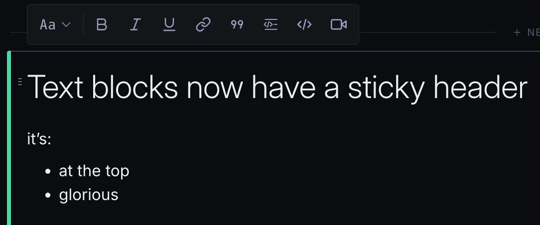
Of course, you can also still type markdown if you're into that!
You can now provide custom values in enum filters, allowing you to handle cases where enum options change over time or when working with dynamic enums that have too many values to display.
You can now expand the AI's progress to see its thought process, how it's splitting up its work, and the progress of each task.
The List of aggregation now includes a 'Deduplicate' toggle to automatically remove duplicate values from the output field.
Every block now has a quick-access "Ask AI" button. For, you know, even quicker access to our AI when asking about a pre-existing chart or table.
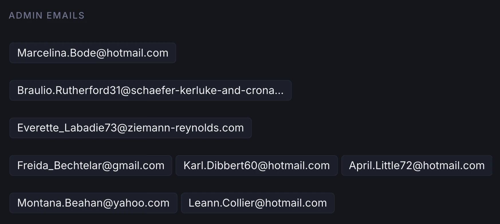
You can now collapse values into one field using the List of aggregation, usable both under Summarize and New Column steps.
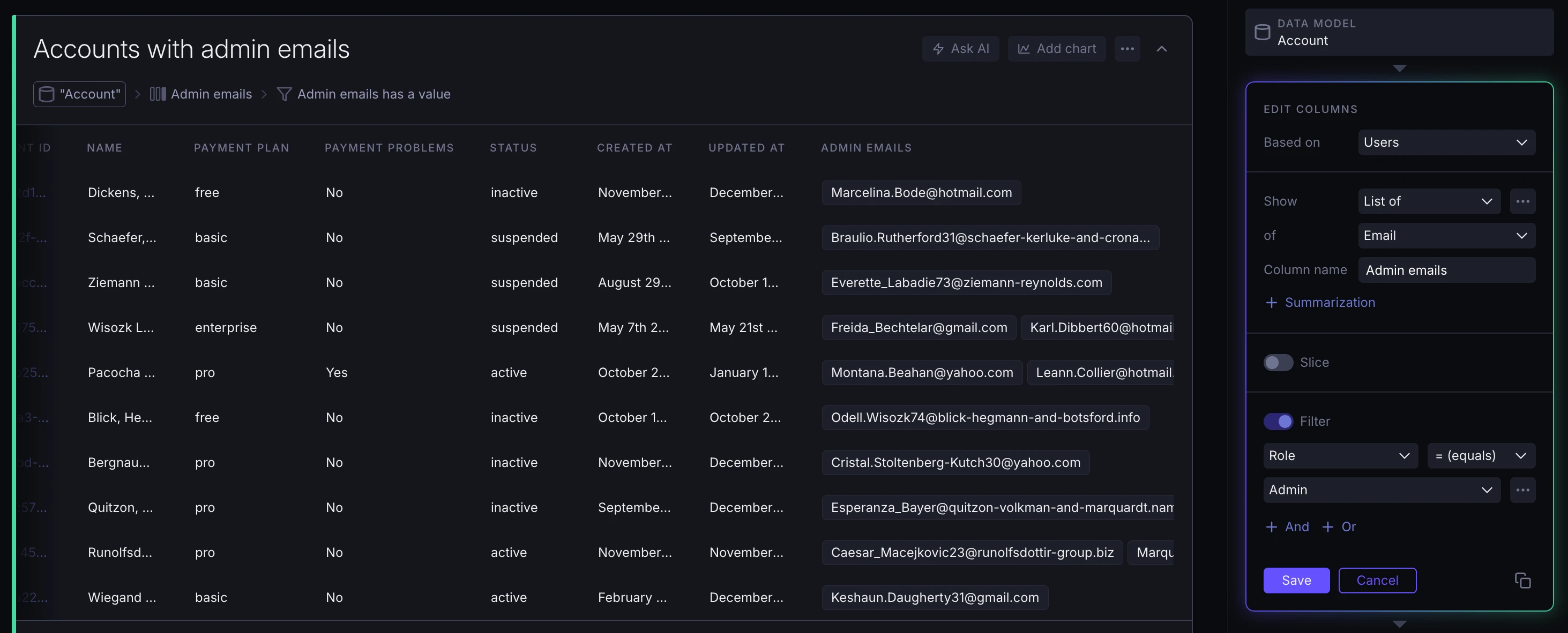
The resulting field visually collapses every one of these values into a tag box.
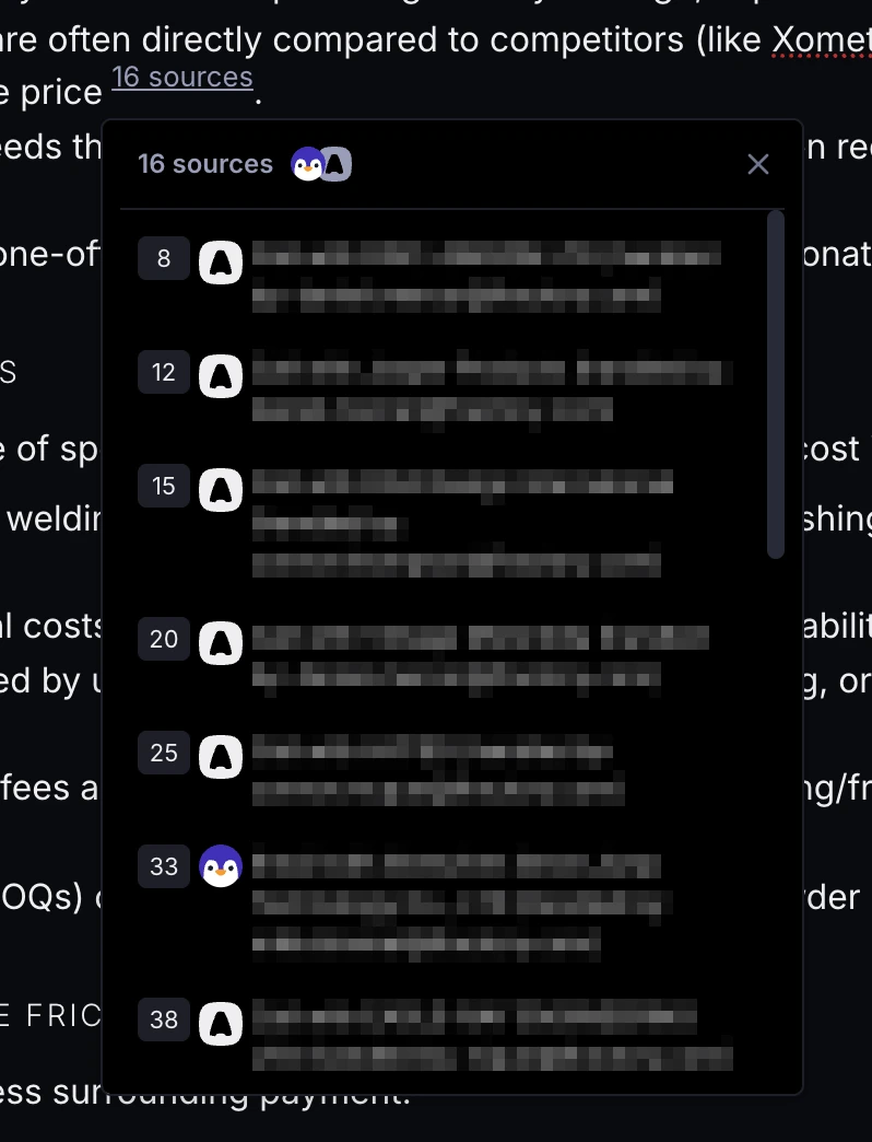
When AI provides multiple references for the same claim, these are now grouped together and shown in a popover with links to each.
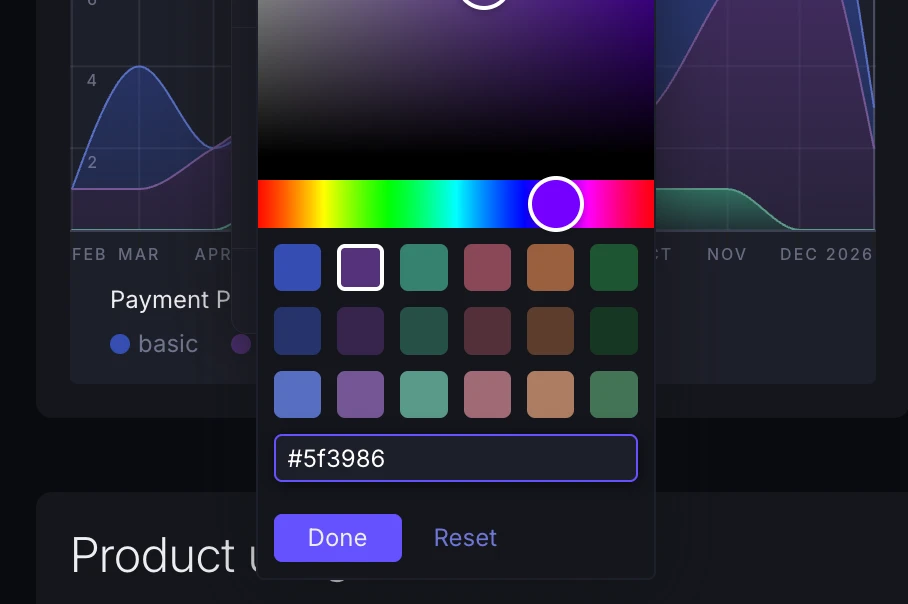
You can now give charts exact hex color codes, in addition to picking presets or using the color picker.
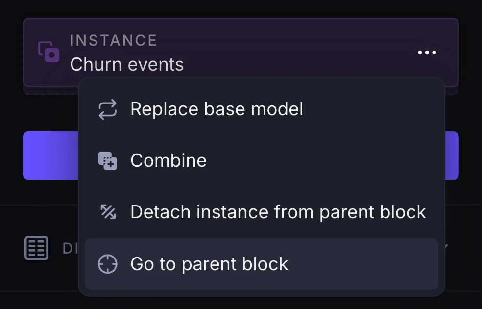
Wherever you see references to other blocks (e.g. instances, combined blocks, funnel or retention chart inputs) you'll now find a new option to go to that "parent" or otherwise-linked block.
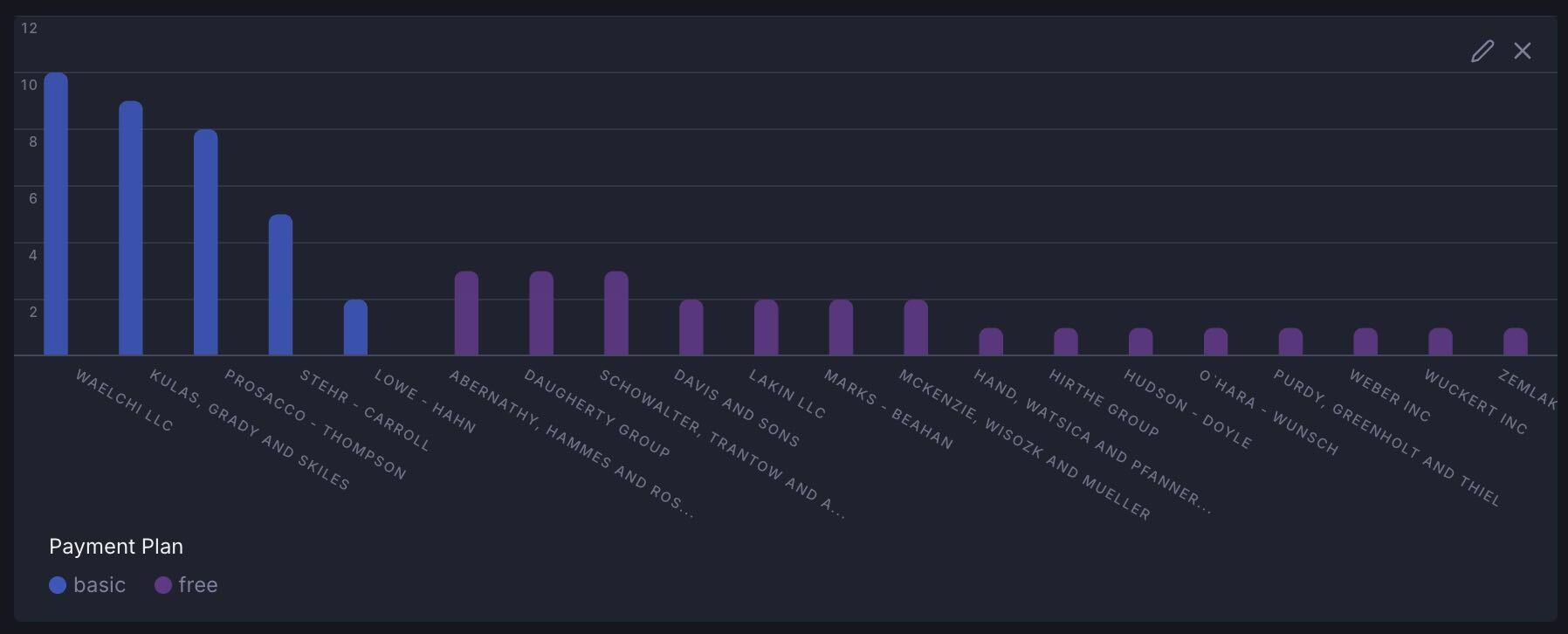
Category chart labels now auto-rotate to a diagonal orientation when the chart gets too crowded. This helps more things fit without you having to fiddle with settings.
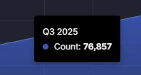
When you're charting unaggregated time series data, charts now auto-detect the time interval between data points. This lets you see something like Q3 2025 instead of 2023-10-01T00:00:00.
The new Data models page under account settings visualizes your account's data models, their fields and relationships on a canvas.
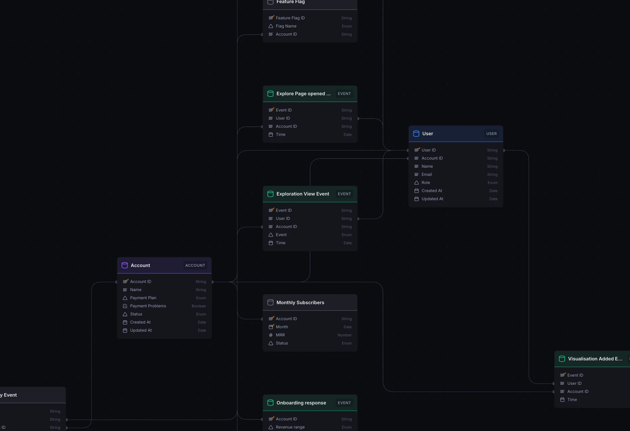
Hover fields to highlight relationships, and rearrange models as you see fit.
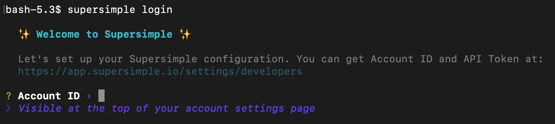
The Supersimple CLI now supports an interactive supersimple login command to set up your environment.
If you do have environment variables already set up, those will take precedence.
supersimple discover CLI commands now default to reusing your account's already-configured data warehouse connection. This lets you more easily run data model discovery and updates, without needing your own computer to be IP-whitelisted or even having the credentials at hand.
Charts now fade other series when you hover over one, making it easier to focus on the data you really care about.
Blocks no longer get auto-selected when you're simply interacting with their quick-filters, pagination, or other quick actions. Keep your selection where you want it. And to really select a block, click its title or anywhere else that isn't an immediate action.
In addition to account-wide system instructions, you can now universally guide AI behaviour through instructions specific to each integration and database connection. Find it under Account settings -> AI.
Dropdown menus got a visual overhaul and can now be navigated with your keyboard! Finally.
Databricks data warehouse support has officially landed!
Python blocks now share dependencies more efficiently, significantly improving performance whenever the same dependencies are needed across different blocks, and when re-running an existing Python block.
Thanks to several optimizations, AI queries respond up to 3x faster. More questions, more answers, less time.